
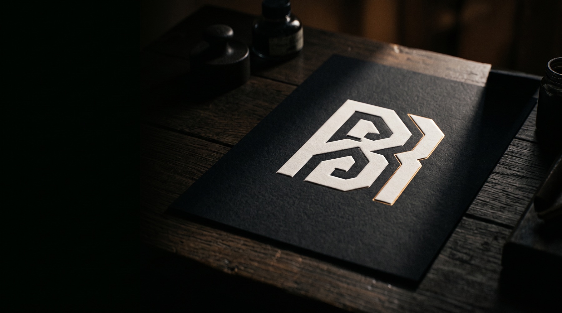
Logo Design
A logo is not a picture of what you do. It is the shortest possible argument for why you are worth remembering.
Most logos fail in the same two places: too complicated to read at sixteen pixels, too generic to matter at sixteen metres. We draw marks that hold their shape at both ends, then hand you the rules that keep them honest everywhere in between.
No line item you have to ask about later.
- Discovery and competitive audit
- We map every mark in your category so yours cannot be mistaken for a competitor.
- Three routes, drawn properly
- Not thirty thumbnails. Three real directions, each argued and presented in context.
- Full construction
- Primary mark, secondary lockups, monogram, and a responsive set that steps down cleanly.
- Colour and clear-space rules
- Exact values for screen, print, embroidery, and single-colour reproduction.
- Master files
- Vector originals, web-ready exports, and a usage guide written for people who are not designers.
Four stages, in this order, every time.
-
01
Audit
Two weeks looking hard at your category, your customers, and everything you have already tried.
-
02
Routes
Three distinct directions presented in real application, never on a white void.
-
03
Refinement
One route chosen, then drawn to final: curves, spacing, optical corrections, the invisible work.
-
04
Handover
Every file you will ever need, plus a guide that stops the mark being misused next quarter.
Everything, in files you own.
- Primary and secondary marks
- Responsive mark set
- Monogram / app icon
- Colour specification
- Clear-space and minimum-size rules
- Logo usage guide (PDF)
- Vector and raster masters
Ready to start logo design?
Tell us what you’re working with. We’ll come back within one business day with a scope and a number.
Start a project